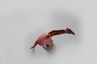
The second project for Experimental Animation called for cut-out animation. The hands-on process really tested timing and spacing sensibility. That being said, this clip is a fast-paced explosion of animals cut out from many issues of Ranger Rick Magazine from the early 90's. My friend and classmate Jeff Ockerse (Jefockerse.blogspot.com) worked together cutting out all the animals, drawing on some of them, and moving them around beneath the camera. We generally went back-and-fourth between camera and animator every time an idea was completed. Jeff drew all the extraneous drawings. Our biggest influence during the project was Terry Gilliam's animations for the Monty Python films (http://www.youtube.com/watch?v=xs7WaL44_Iw).
If we were to re-vist this project, we would try and add more drawn elements as well as some extension on the time/frames spent on specific images. For example, there's a part where the vulture quickly grows a new head (of a seagull), only to have it explode instantly. On the upside, I felt like the music I found fit together with the imagery and movement surprisingly well. A sound-effect pass might be worth a shot, too.
The best part of the project was that we could keep running with new ideas - experimenting - until we ran out of animals, time, and SD card memory. The worst part was probably the mess of torn up magazines. Everywhere (we should have made a stop-motion of us cleaning it all up).
The textural glows come from the fact that we painted over every frame on Photoshop with a specific gray color. We did this to get rid of some of the messiest frames that came about when we accidentally pulled our backgrounds around too much. I added extra frames in After Effects to have smoother transitions between the beginning, the end, where the vultures come in - etc. Another thing we noticed was that the first set of animals that we shot had more of a blue tint - something we could have easily fixed in Photoshop or After Effects - but we decided to keep it to add variety (as well as save us on the time crunch). If it were to be revisited, that would probably be our first thing to try and change. I'm also really wanting to bump up the colors and vibrancy.


No comments:
Post a Comment