I've had the pleasure of working on a handful of concert poster art for my friends at BravoArist this year, including the beast that was Spring Fling 3. As I finish up what looks like my last one for the year, I wanted to post a recap of the ones that I've made since my last poster-post back in April! Stay tuned for rants and sloppy sketches of ideas:


Two really quick ones. Cayetana: Cory says, "do a poster with Linda".
Blue hair because the singer of Cayetana has blue hair!
Dogs on Acid: I needed to draw this after I had a dream where I wanted to draw it.


Jukebox Breakdown: my friend Alex asked me to make an illustration of sad jukeboxes.
I designed a quick logo to match. It's been fun heading upstate to these every now and then to join in on the madness (as well as the long island specials).


Christmas in Hawaii Party: Quick one again, and the first one I made on a Surface Pro!

-------

Masked Intruder: this one was huge for me, and the second I have done of Masked Intruder. I absolutely love all the bands on the bill - some of Columbus's finest punkers. Skashank Redemption is a ultimate favorite of mine who I've been following for a few years now. All their shows are a blast, and I have been found skanking my ass off at a handful of them. When Cory told me he finally found a bill perfect to book them on, I flipped out. I gave the guys stolen ska instruments and had them running with some zombie dogs as a homage to Skashank and Cadaver Dogs.
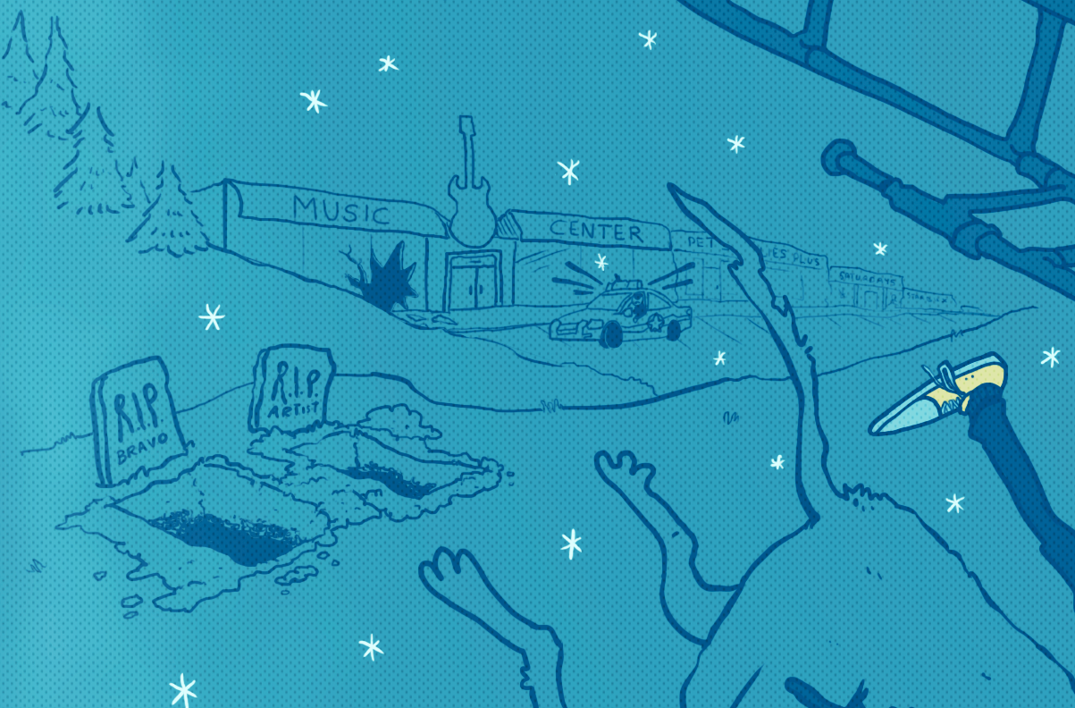


I left the patches on their jackets empty, waiting to do them last in case I thought of anything special. The day I sat down to finish the piece, news went up about how the drummer from one of my favorite bands in the same vein, Teenage Bottlerocket, lost their drummer. Bands, friends, and fans were posting condolences - including a very sweet one from these guys. A variation of the TBR logo felt right to draw on the patches as a tribute to Brandon:


-----------

Man Overboard: words cannot express how sad it was to hear that this tour was canceled. Man Overboard is literally the guiltiest pleasure band I listen to consistently. I love them! I love them so much I had to rip on their "DEFEND POP PUNK" branding hard with my favorite childhood weaponry, a Super Soaker XP 105!

-----------
 +
+ .jpg) =
=
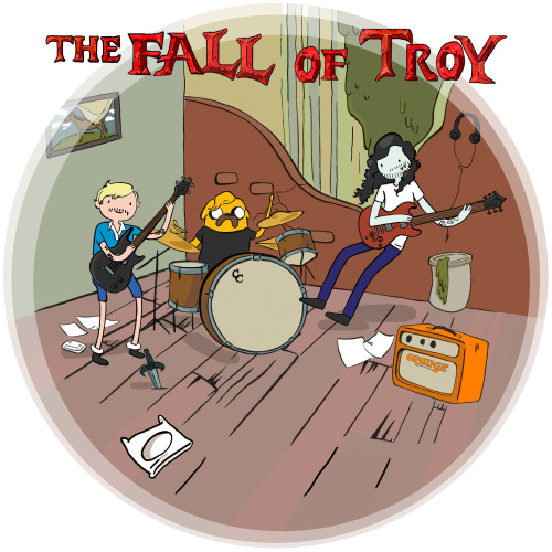
The Fall of Troy: Here's a band with incredible musicians. I admittedly found them during high school through my Guitar Hero obsession (the closest I ever got to being a cool band girl besides being in marching band)(I was really good enough to beat the Dragonforce track)(with a rubber band around the first button). I know they're better than lots of the bands I usually make posters for - mainly because I had more than 3 musician friends in Columbus drive all the way up to Cleveland with me to see this one (thanks for the ride, Dorian)!

The tour ad-mat was Adventure-Time themed to match the tour's title - Adventour Time - and since the show was such a huge one for my friends, I wanted to help give the Ohio date more attention. I visually mocked the album art they were celebrating, used the adventure time versions of themselves from the already existing art, and thew in Guitar Hero controllers because I am a nerd.


(I ended up getting a few sketches during the show, too)
-----------


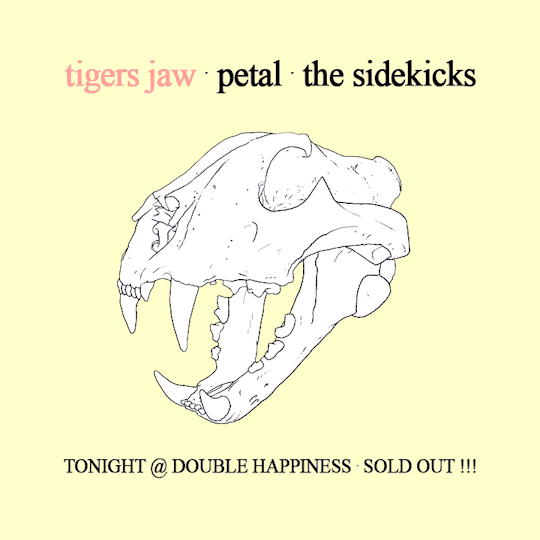
Tigers Jaw: This was an incredible lineup for a show. We needed to do something quick, and I wanted to do something super obvious. It looked like a sister design for a similar demographic show that was coming up after it - we got to print small handouts with the two designs back to back. This essentially is just a photoshop trace of a photo of a tiger's jaw. The simplicity worked well, because this is really the only thing I wanted to make:
ISMFOF: Words are not able to describe feelings for this guilty pleasure band of mine. I was obsessed with their album art (I even made my boyfriend a valentine last year that mocked it). I figured making the poster such a close representation of it would help attract the old fans and keep the energy that attracted fans like me in the first place. Fire plus a caterpillar being impaled sealed the deal - someone pointed out to me that it's a little more NSFW than I intended, considering the new album title being "Caterpillar Sex". Sorry mom!


Though it felt odd mocking their old artwork, my coworker pointed out that their album art actually looks incredibly similar to one from a grindcore album that dropped 4 years before by Combat Wounded Veteran. Can't go wrong with guts and pink/orange/white/black color schemes.
-------

Rock n' Rescue: My friend Stephanie was super excited about throwing this show for her local doggie organization, so I tried taking a stab at the idea of a cheesy community flier you might see on a church or coffee shop pin board. This poster was made totally in Flash! I wanted to give it a shot and take a break from being in Photoshop so often. I love animating in flash because of vector shapes and clean control of points - I'll happily be drawing there more in the future.


-------

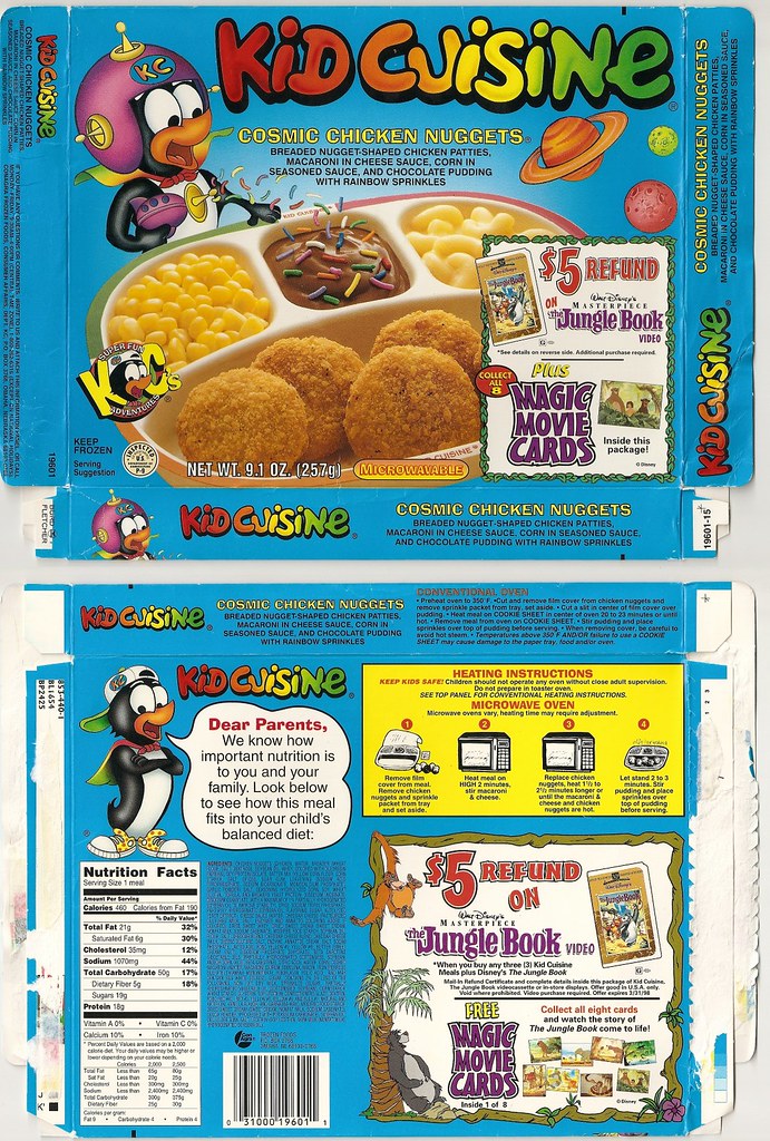
Microwave: I had the most fun time making this one, and likewise the absolute best time seeing everyone's reaction to the poster leading up to the night of the show itself. Microwave is a band I fell very hard for, and I knew I couldn't do a half-assed job if I was going to be poking fun at their name. I also knew all of the locals pretty well and wanted to make them something memorable.

This particular Kid Cuisine that I basically traced was my favorite from my pre-vegetarian childhood diet. I made sure to slap some Kroger Manager's Special discount stickers on there, and add some easter eggs in the bottom left corner. I was flattered that people were asking for "screen prints" of it - considering all of the gradients and pixelated chicken nugget texture taken straight from the original image...!
All done! If you really read all this - thanks for your time! Come out to a show and say hi.


